If you weren’t previously hyped for Marvel’s multitude of newly announced Disney+ content, prepare to be. We have a lot to discuss.
Over the weekend, Disney Studios sated the appetites of rabid fans at their D23 Expo with some exclusive reveals, including brief footage, concept art, and official posters for some upcoming projects. But now the public can share in the fun, as some of this stuff, specifically the concept art and posters, are being released. And we, being ravenous fans with a desire to nitpick and study every inch of new material, are going through this stuff with a fine-toothed comb, looking for clues.
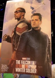
The first official poster for The Falcon And The Winter Soldier dropped earlier today, sparking a heated discussion about the most trivial of subjects. Yes, Bucky Barnes, whose gloriously long hair has been a trademark of the character’s appearance since 2013, has finally visited a barber, it seems. Either that, or the graphic designer made a huge blunder by choosing to use 1940’s Bucky as a reference for this poster, rather than modern, stylish-Jesus Bucky.

Apart from Bucky’s new haircut, we can see that the Winter Soldier is donning a slightly new, streamlined outfit, as well as his vibranium arm (which still hasn’t seen any real action: here’s hoping we get to see some epic metal-arm fight scenes in the show). Falcon, who was entrusted with Captain America’s shield in Avengers: Endgame, is…not holding the shield, for whatever reason, and is also positioned behind Bucky, looking more like a supporting character than the lead. Perhaps both men are leads, but it does seem a little unusual to place the Marvel Cinematic Universe’s new shield-bearer in the background. Then again, he does also show up in the top right-corner of the poster, flying across the sky, looking very much like a patriotic fighter-plane. In fact, the poster does seem to be going for a “war-movie” vibe – the pale watercolor sky, the ever-so-slightly antiquated heroic poses from Bucky and Falcon, the red, white and blue logo: it looks almost 1940’s to me – but again, considering that Falcon isn’t a time-displaced character like Bucky, that choice seems peculiar. Who’s the lead on this show, really?
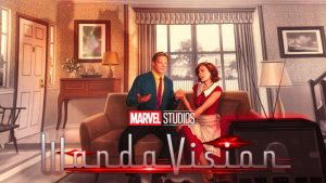
Speaking of old-fashioned stylistic choices, though, the first official concept art/poster for the WandaVision series is blatantly dated: and both lead actress Elizabeth Olsen and Marvel president Kevin Feige have said as much. The show is said to have a retro, 1950’s sitcom style – at first, this seemed like it might have just been a creative reference for the showrunners to draw on, but this art suggests that the entire series will, in fact, look and feel like I Love Lucy, combined with idealized, bright and sunny ads ripped from the pages of an old Sears catalog.

It’s an even more peculiar stylistic choice than that on the previous poster, because neither Wanda Maximoff nor her (currently deceased) partner Vision have any real connection to the 1950’s. Yet here they are, dressed in period-appropriate fashion and sporting upper-class bemused smiles, surrounded by the accouterments of a typical “nuclear family”.
Wanda, the Scarlet Witch, has some untapped potential in the MCU that could explain this perplexing choice – in the comics, she has the ability to warp reality and create entire “pocket dimensions” that exist alongside our own. In such a faux reality, Wanda could presumably resurrect her dead lover and create a perfect, cheery little family for herself in a quaint little suburb: according to reports from D23, Wanda and Vision will have a nosy next-door neighbor, played by Kathryn Hahn, and a bunch of other comedic castmates – including the Thor franchise’s underdog Darcy, and Agent Jimmy Woo. Another sign that Scarlet Witch will use more comics-accurate powers in the new series is a hint, in this poster, of her more comics-accurate costume: Wanda’s shadow, in the top left-hand corner, sports her traditional crescent-moon tiara, something that hasn’t appeared in the MCU as of yet. Fans have been dying to see it on Elizabeth Olsen’s brow, and this poster gives me hope that we will.
Don’t expect WandaVision to be all canned laughter and sunshine, though – the series is rumored to head into dark, even macabre or paranormal territory, which makes sense, considering that it will always lead directly into the events of Doctor Strange In The Multiverse Of Madness, which is being hyped up as Marvel’s first horror film.
What do you think of the new concept art? Does it look cool, or outdated? Share your thoughts in the comments below!